So what was the process I went through to get there?
I made a logo. I went through a variety of processes. I changed the colour palette throughout to get it really refined. Here is a peek at the process to come up with my logo:


I had the original idea with the mexican skull woman design and spent a lot of time planning and creating this painting
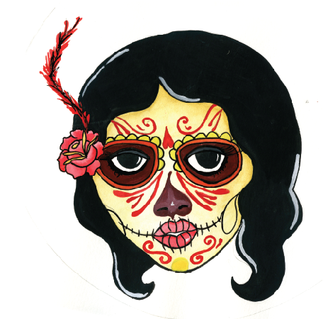
She was looking really good but then I rushed the designs that went over her face, this kind of ruined the image for me so I spent a some more time on finding a way to present it. I started dong a tidy on photoshop but decided a trace in illustrator would look clean and crisp. So I started to trace the image:

This took me ages and was not coming out as wonderfully as I would have liked. I'm happy with the rose but I think I need to learn some more techniques for colouring and shading to really bring the image to life.
Another major issue occurred to me whilst working on this. The packaging is going to be tiny, is the detail in this image going to be lost once it has been shrunk down to the size of a thumb print? I decided yes and scrapped the idea completely.
So I went back to a simpler idea I had thought of earlier. Create an image for each product that is relevant to the contents, make it into a quirky line drawing and make a simple trace of it in illustrator.
Here's how they turned out:

Now that I have a definite colour palette, a logo and some imagery I'm ready to start composing my designs. First I bought my product packaging and nutted out the dimensions of each product so I could make up a template for each in Illustrator:

I started fiddling around with composition. I had begun this process before I had the final colour palette. The design was not working for me so I just kept changing things around until I came up with something I was happy with:

I like how its put together but the colours don't work. The design is quite clearly inspired by retro 50's and 60's packaging. This is an important component as this is where the problem of so called "scientific breakthroughs" in the cosmetics industry. It is also a very popular design concept in present day. The type I used on the back (made into little sticker labels) has very heavy grease lightening connotations. Its like the font is almost made out of hair product, or is in the form of a man's perfectly groomed quiff:
Here is the final design with the correct colours and composition (remember the back can only be one colour):

Probably the biggest challenge in the brief I project I created for myself is the size. Packaging for cosmetics is so damn tiny. And I'm sure you've noticed that the size of the ingredients list on the back is even tinier! I had a peice of information that I wanted to put onto every label but in the end had to make the decision to cut it because the work would just become too cramped and untidy. I decided just to include the most important info and that is the toxic ingredients it contains, what the ingredients can do and what other toxic ingredients could be lurking in the same products. I also managed to sneak in the web address to seek extra info on a few of the packages.
I was also inspired by those really basic toothpaste tubes that you see on movies where the only words you see on it is "toothpaste" or "foot cream" etc
Once the first design was completed the rest were reasonably easy:
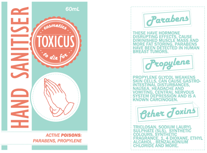


The majority of text is done in caps staying true to most packaging I see. Aligned to the left to avoid rivers, leading and tracking quite often needed to be adjusted to fit the information into the space appropriately. Front of packaging is clean and clear to grab attention and gain focus from my audience. Once they are curious they will look to the back to find out what its all about and hopefully be shocked at what these everyday products can do to us.
Justification to the brief
In relation to the brief.. no these designs are not post cards... not your everyday postcard anyway! The final prototypes are small enough to fit into anyone's mail box and they take the same role as a promotional postcard. I have quite often received postcards that are not usable. The purpose is purely to present information to a particular audience.
Audience
My "cards" would be distributed in the central areas of the city, using the same idea as junk mail deliverers, these households are likely to be big time consumers therefore my campaign would have most effect on them. I'm pretty sure the subject I have covered would be a subject that at least 90% of women in New Zealand would have an opinion on, so these will work in many places but price wise, if these were to be distributed it would be most appropriate in "wealthy" areas.
Distribution
The products would be sent out one by one (the first already in the make up bag) to keep the audience guessing and waiting in anticipation for the next product, therefore keeping their interest and attention for longer. The products can then be stashed in their bathroom with all their other cosmetics so they can refer to them and compare when they have any doubt or questions about their products.
Other uses
These products would be great for other companies to use if they wanted to get behind the cause. Many people are becoming aware of these issues and would go out of there way to find companies and brands that are "green". I can imagine my products as free-bees at a women's expo or or promotional materials sent out with catalogues.
What would I do differently
Given more time and budget I would have chosen better product packages that all fit together cohesively. Thought of filling the inside of the products with black, sticky or oily substance to enforce the idea of toxicity. I also would like to have thought of more interesting printing techniques or materials to print on.
A weakness in my designs is the tiny size I think I could have catered better for it in my designs by refining the information or by choosing better colours (the yellow is particularly hard to read in certain lights) but in all fairness real packaging labels are often even more difficult to read, the font size on mine gets down to size 5 but when I compared it to the original label, my type appears larger.
These have all been printed onto glossy labels, cut out and stuck onto packages.
No comments:
Post a Comment